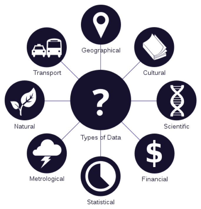
What is Data?
|
“facts and statistics collected together for reference or analysis”
It is collected (measured) through observation in order to analyze and report. Ultimately it is best visualized with graphs, images, info graphics or other analysis tools. Grammar: data is a set of values (plural) and a datum is a single value (singular). Try getting used to saying "the data are..." Some people may think that 'data' and 'information' can be used interchangeably. However, a data set becomes information only by interpretation and only becomes information suitable for making decisions once it has been analyzed in some fashion. Knowledge is the understanding based on extensive experience dealing with information on a subject. |
|
Data Visualization
Uncovering key insights is one skill and communicating them is another (equally important) skill - both critically important to the story you are trying to tell. Data visualization is not just the graphic display of quantitative (or qualitative) data, it is concerned with displaying data in a way that is easier to comprehend. It allows us to extract and communicate insight through compelling stories, using data to demystify something complex or spur action. When creating any kind of graphic, whether in a design studio or for this class, you always have to ask: what are you trying to show? What story are you trying to tell? For example:
NO: "shows the progression of temperature during the experiment"
YES: "shows that box A was consistently warmer than box B during the experiment"
'Data storytelling' represents an exciting, new field of expertise where art and science truly converge into "cognitive art".
NO: "shows the progression of temperature during the experiment"
YES: "shows that box A was consistently warmer than box B during the experiment"
'Data storytelling' represents an exciting, new field of expertise where art and science truly converge into "cognitive art".
Data Storytelling
For some, crafting a story around numbers (data) can seem unnecessary - after all, shouldn't the numbers speak for themselves? These insights or facts should be sufficient to stand on their own as long as they're reported in a clear manner. While logical, this is not always true. In fact, research in the neurosciences shows that decisions are often based on emotion, not logic. Data visualization expert Stephen Few said, “Numbers have an important story to tell. They rely on you to give them a clear and convincing voice.”
Data storytelling is more than just graphic design - it is a structured approach to communicate data insights and involves a combination of three key elements: data, visuals and narrative. It is the seamless blending of hard data and human communication.
•A compelling narrative crafted around and anchored by compelling data
•Provides meaning and value
–“in a world where we are besieged by data but desperate for meaning”
Graphical excellence is the well-designed presentation of interesting data – a matter of substance, of statistics, and of design. (Edward Tufte)
|
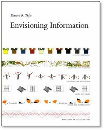
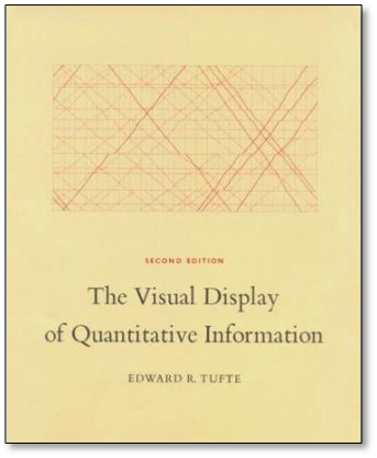
Allow me to introduce you to Edward Tufte, a statistician and professor of political science, statistics and computer science. He's not a designer, but he's known for his writing on information design and is a pioneer in the field of data visualizations. These two books (right) are well worth buying (or at least borrowing from the library). His writing demonstrates the 'laws' behind graphic excellence and visual clarity that transcend well beyond style and aesthetic preference. Even beyond this class, his work is particularly relevant. |
|
|
Visual displays rich with data are not only an appropriate and proper complement to human capabilities, but also such designs are frequently optimal. High density designs also allow viewers to select, to narrate, to recast and personalize data for their own uses. (Tufte). Graphics reveal the data - “at the heart of quantitative reasoning is a single question: compared to what?”. High density designs allow users to select, narrate and personalize data for their own uses.
Graphical excellence is that which gives to the viewer the greatest number of ideas in the shortest time with the least ink in the smallest space. (Tufte)
|
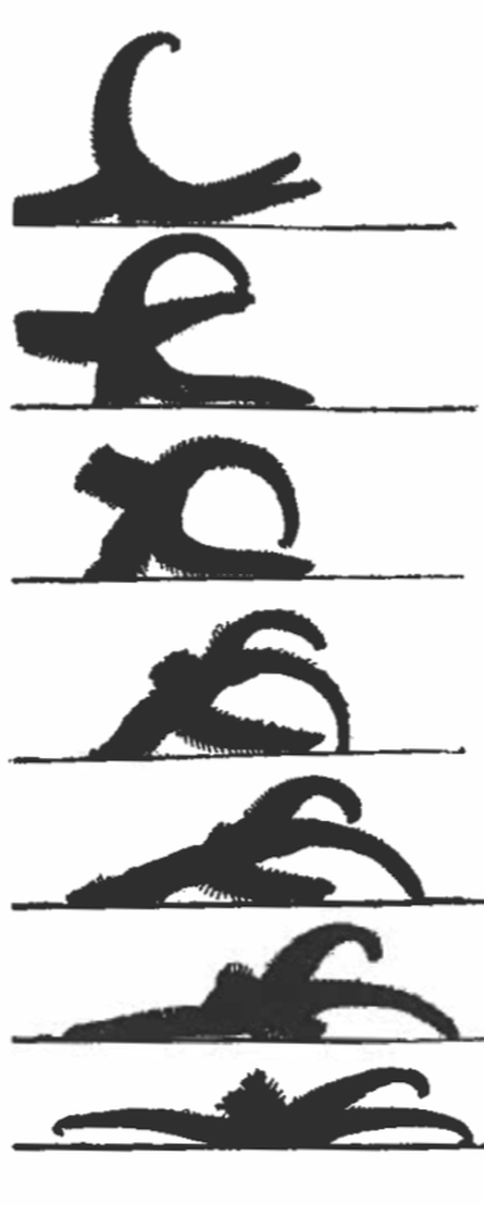
I believe one of Tufte's most relevant concepts is his idea of small multiples, which "move to the heart of visual reasoning - to see, distinguish, choose." "The multiplied smallness enforces local comparisons within our eyes pan relying on an active eye to select and make contrasts rather than on bygone memories of images scattered over pages and pages" This idea visually enforces comparisons of changes and the differences among objects. A constancy of design puts the emphasis on changes in data, not changes in data frames (graphics). This concept is shown left (and below) showing a starfish turning over. 
|
The object on its own may not be clear, but showing multiple images together give more clarity to the single image.
|
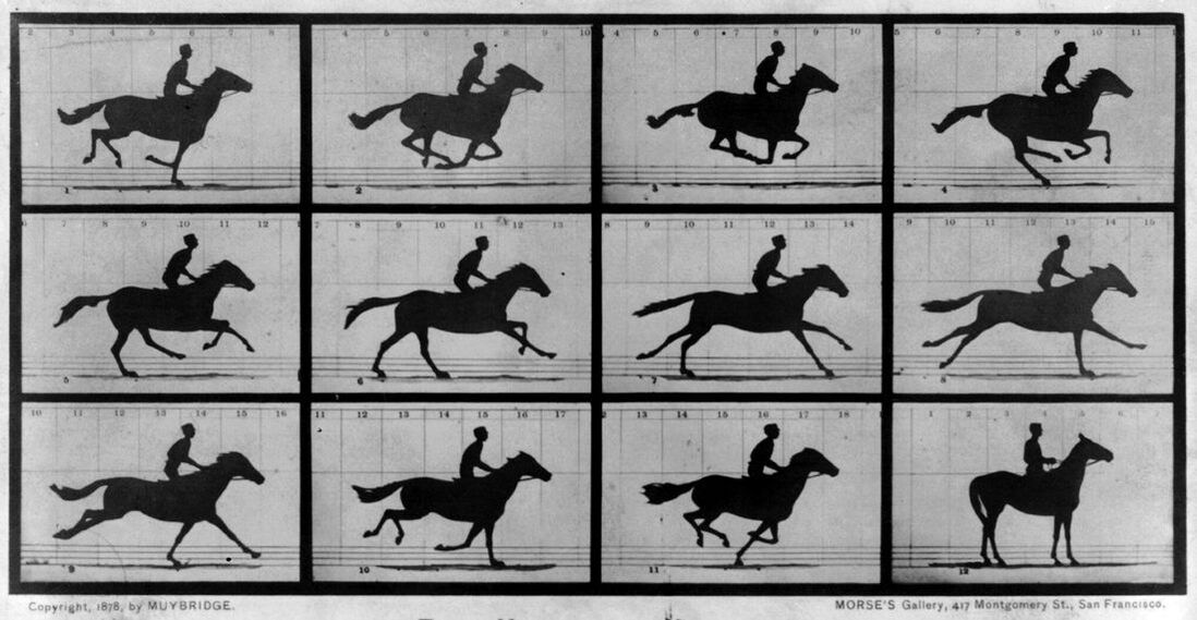
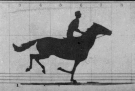
Eadweard Muybridge's Horse in Motion series (shown above), is another example of small multiples, showing (for the first time) that a horse will lift all four hooves off the ground during a gallop. Though this is information is not necessarily useful for our purposes, the work broke new grounds of artistic expression in sequence and became the foundation of the development of the motion picture. When Muybridge compiled this sequence around 1886, the video camera had not yet been invented. Below are some other examples: |
|
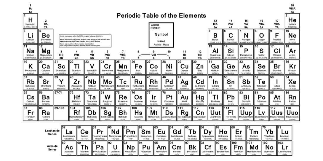
And an obvious one, but also one that you might not expect... the Periodic Table of Elements! One small square shows quite a bit of information, but once you understand how the single element works, the eye can comprehend a significant amount of data without extensive effort from the viewer.
A chart with many series shown on a single pair of axes that can often be easier to read when displayed as several separate pairs of axes placed next to each other. He suggests that this is particularly helpful when the series are measured on quite different vertical (y-axis) scales, but over the same range on the horizontal x-axis (usually time).
Graphical excellence consists of complex ideas communicated with clarity, precision, and efficiency. (Tufte)
|

|
Trust & Data Analysis
There is a lot of content out there... and a lot of bullshit. If you can anchor your story to credible data, audience are more inclined to trust your message. Your audience may need help to understand, but it is not stupid - disrespect for your audience will leak through and damage all further communication.
“No one can write decently who is distrustful of the reader’s intelligence, or whose attitude is patronizing”
-E.B. White
“No one can write decently who is distrustful of the reader’s intelligence, or whose attitude is patronizing”
-E.B. White
Spirit of the Individual

This is a photo of Maya Lin's Vietnam War Memorial in Washington DC. Though it may not seem like it, this monument is also a form of data visualization with a sensitive story in mind. Lin and her team did not want the names of the individuals who died in Vietnam to be listed alphabetically - there were over 600 Smiths and 16 people named James Jones - it "would make the memorial look like a telephone book engraved in granite, destroying the sense of unique loss that each name carried". Instead, names are listed by the date that they died.
For Next Week:
Download and Install Tableau: https://www.tableau.com/academic/students
Watch Tutorial: https://youtu.be/jEgVto5QME8
Bring in some data (in an organized excel doc)
Watch Tutorial: https://youtu.be/jEgVto5QME8
Bring in some data (in an organized excel doc)