Data Visualization Workshop (Tableau)
With your group…
–analyze one of the sample data sets on RawGraphs.io. Post your visualizations (~15 minutes)
–analyze one of the sample data sets on databasic.io. Post your visualizations (~15 minutes)
–Use one of the data sets from last week to create a visualization in Tableau. Post your visualizations (~60 minutes)
For homework: Visualize your own data and post on your own website (use any software)
Tommy Allegretto, Luke Florio, Alex Reyes
|
|
|
Raw Graphs - Description of data set and visualization
|
Databasics - Description of data set and visualization
|
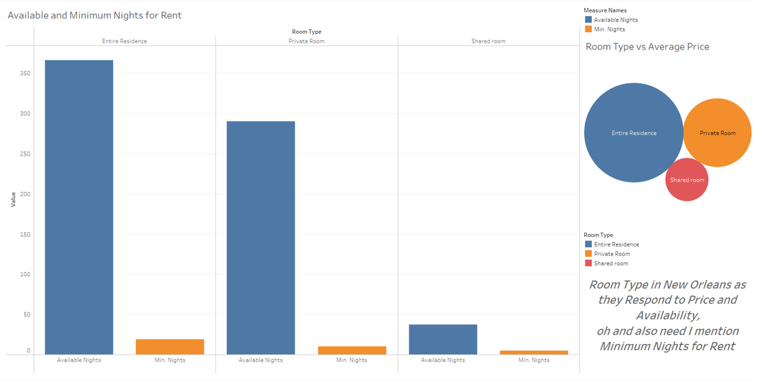
Tableau Visualization(s) - description of data set and results
Sam Doughty, Jacob Ellerbrock
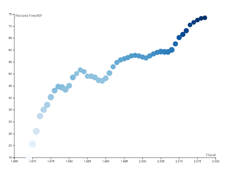
Raw Graphs - Shows percentage of free lunches per total reduced lunches given from 1969-2017
|
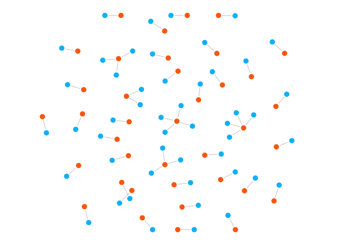
Databasics - Red dots represent number of free lunches given, blue dots represent the years that share the same free lunch distribution
|
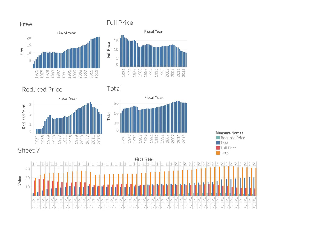
Tableau Visualization(s) - description of data set and results
Ri Glal, Michael Allen, Callie Watson
Raw Graphs - Description of data set and visualization
|
Databasics - Description of data set and visualization
|
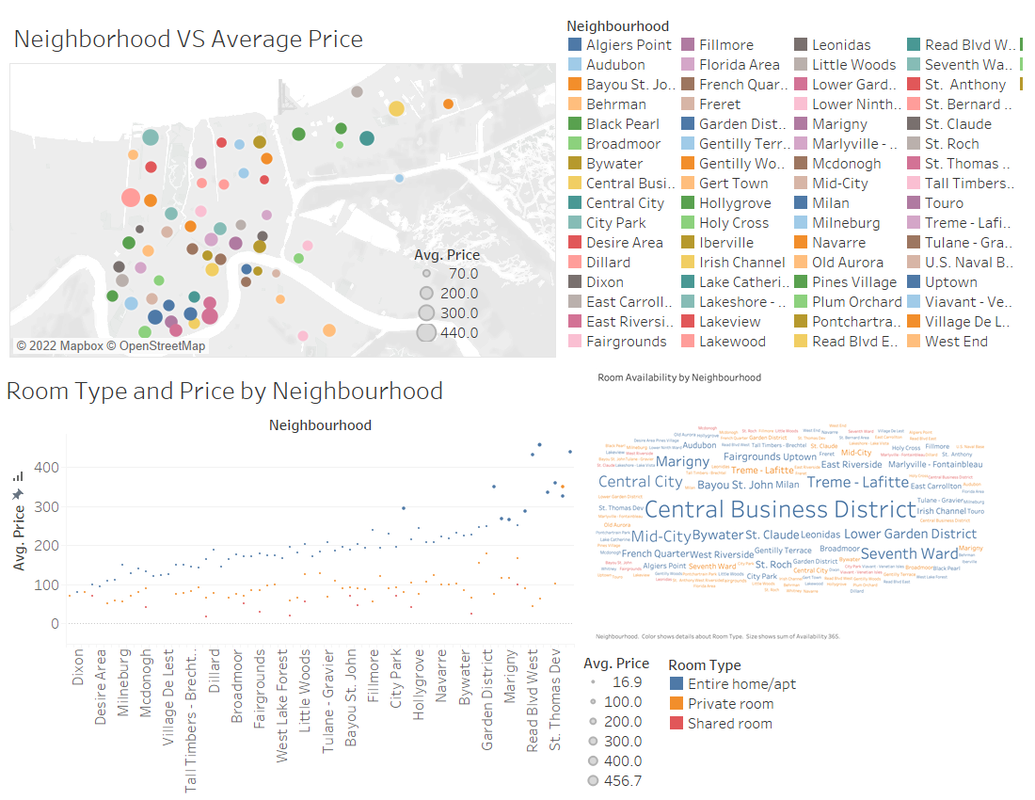
Tableau Visualization(s) - description of data set and results
ARCHIVE:
Will Hutchins, Kailey Olbrich-Daniels, Laurette Parrella, Nicholas Rawlings (2021)
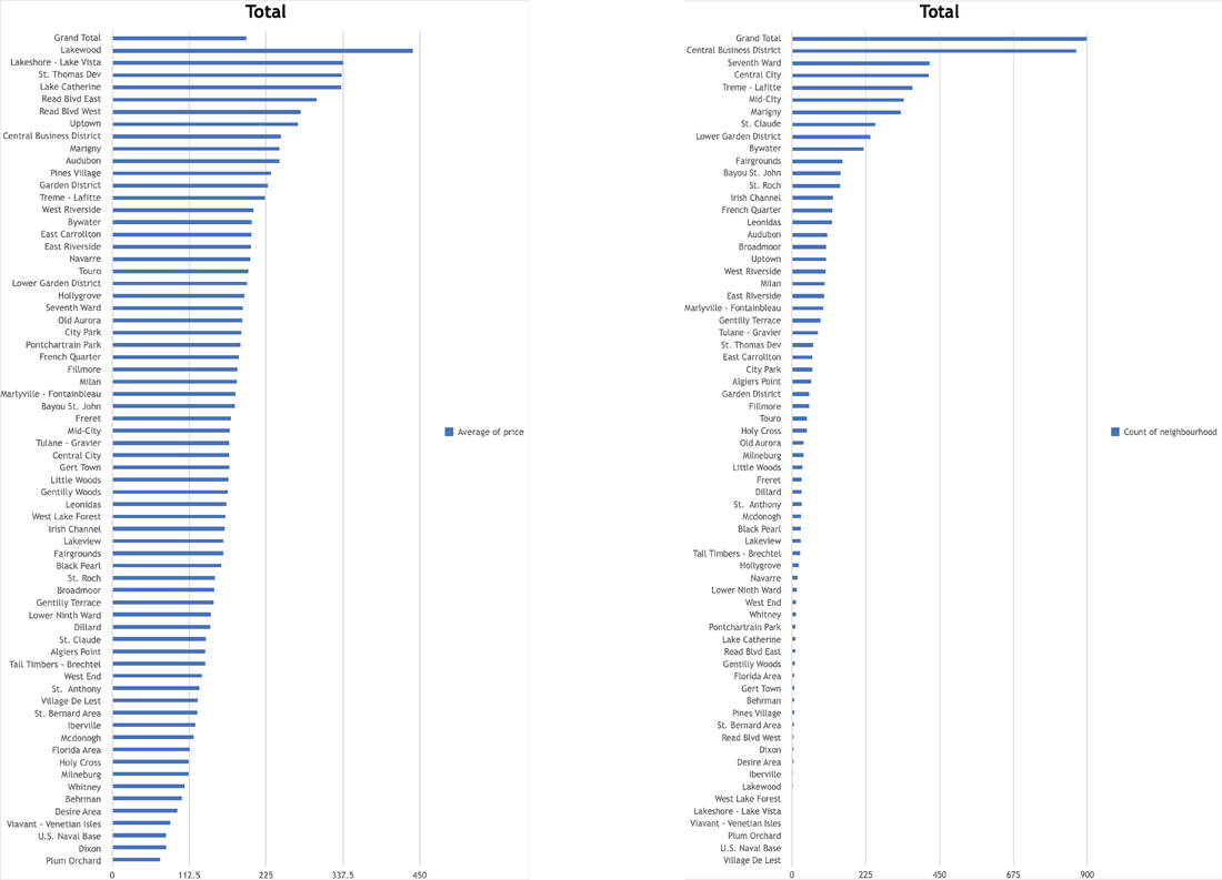
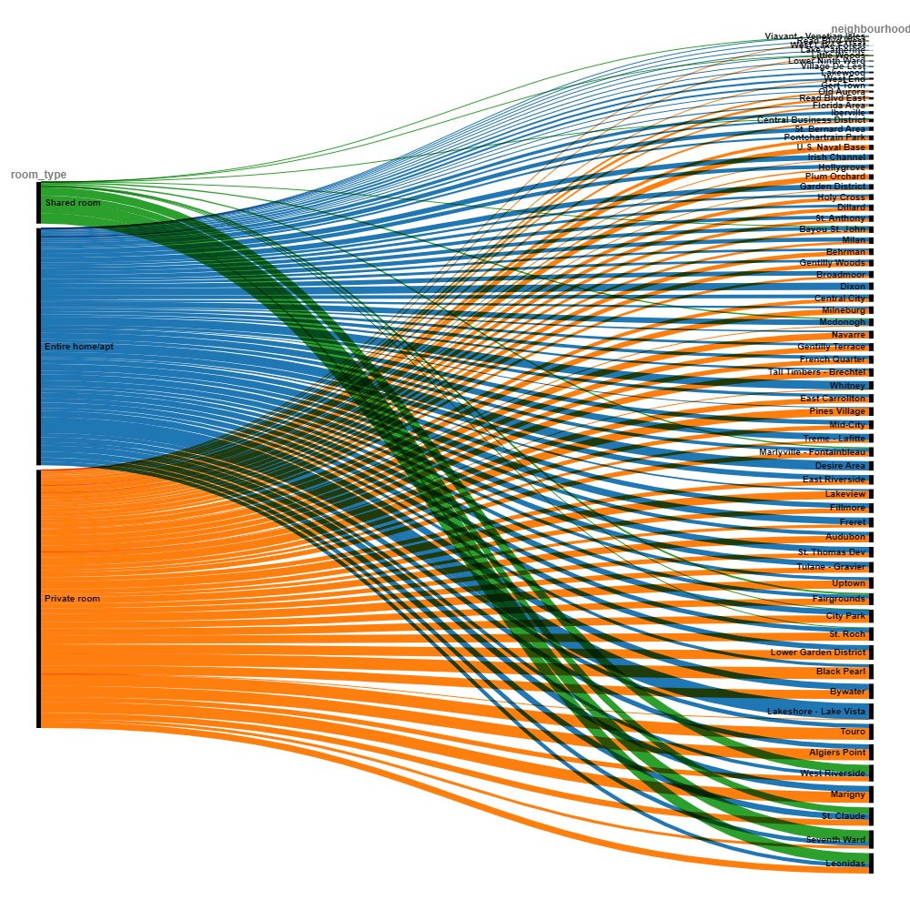
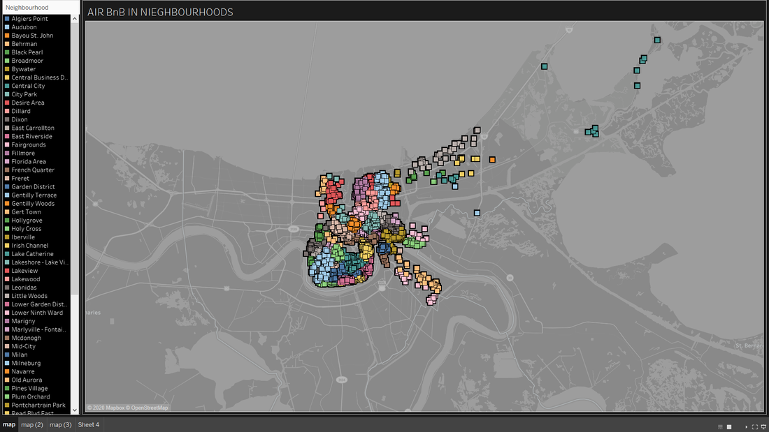
We looked at how the average prices of Airbnbs varied by neighborhood. We also compared the number of Airbnbs available in each neighborhood.
James (2020)
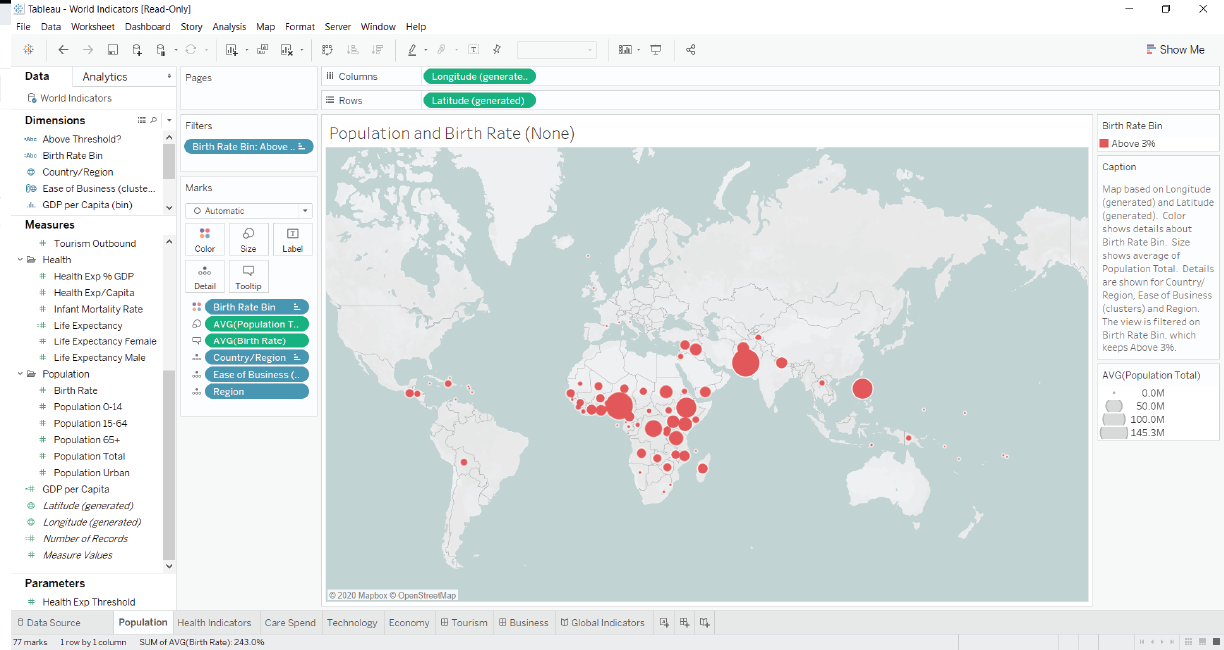
Map based on Longitude and Latitude. Color shows details about Birth Rate Bin. Size shows average of Population Total. Details are shown for Country/Region, Ease of Business (clusters) and Region. The view is filtered on Birth Rate Bin, which keeps Above 3%. At first I looked at the over all birth rate around the world, but then felt it was more interesting to see where has the highest birthrate today. Seems that Africa has a outstanding high birthrate the following years.
Christopher (2020)

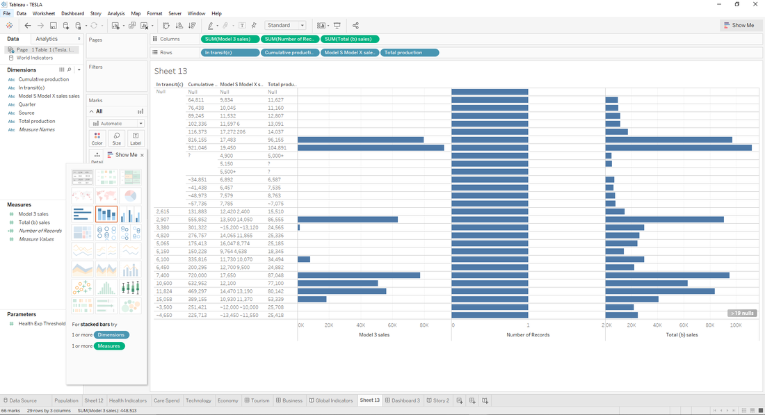

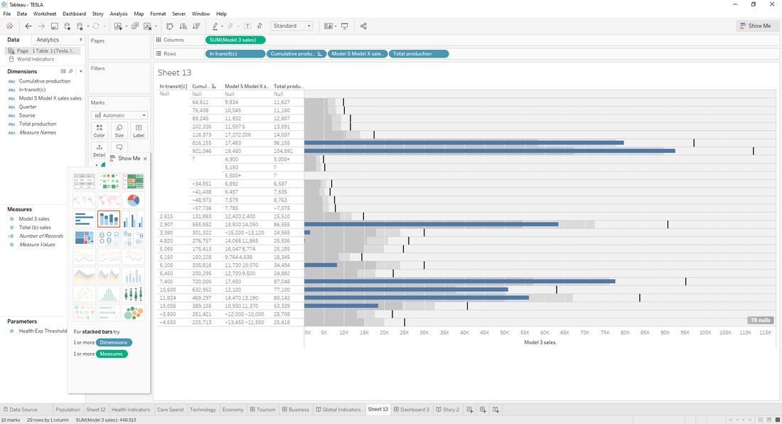
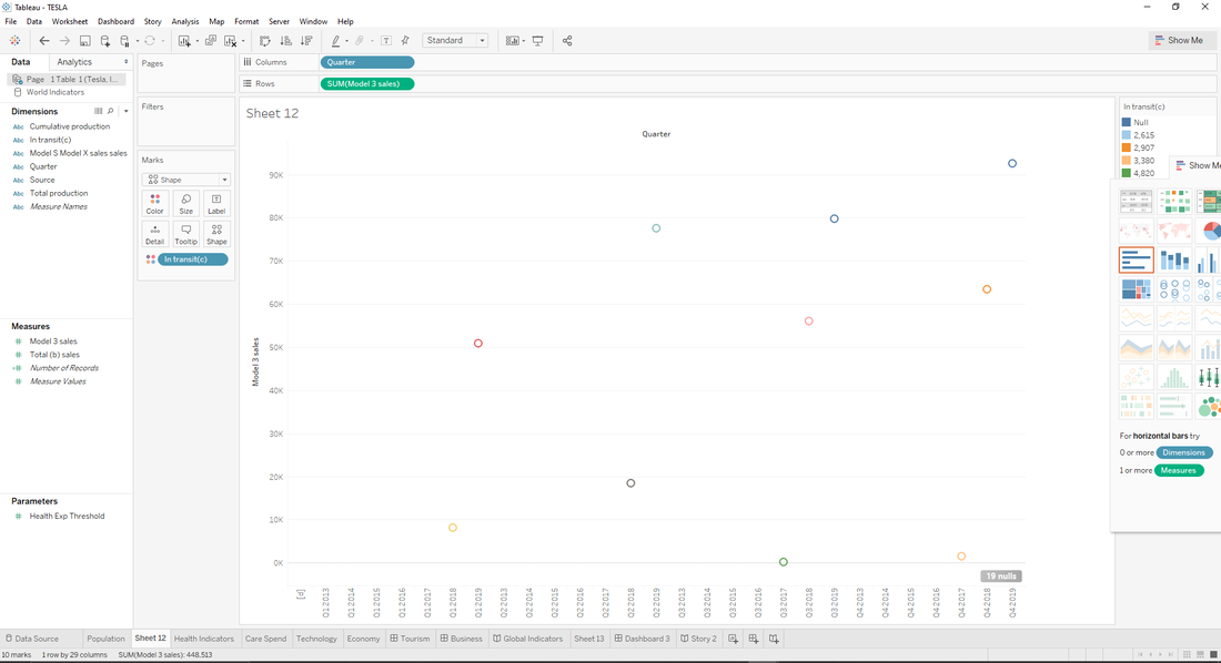
TESLA Sales by Quarter from 2013 - 2019
The tables above illustrates quarterly sales for every year beginning in 2013 and ending in 2019. The information could be useful in comparing production patterns along with technology trends, or fluctuations in the economy. The visualization also helps to predict patterns of growth across quarters and years. Additionally, the data illustrates a comparison of three vehicle variations produced by Tesla. Those include the Model S, Model X, and Model 3 sales. Although the variations in sales vary from model to model, the overall growth of production grows exponentially as Tesla introduces more options for its customers. Since the data was extracted from a PDF, it was hard to modify and specifically contrast quarter by quarter data. Quarter by quarter data can give more insight into why customers choose to purchase vehicles later in the year.
(Extracting data from a PDF is tricky, I was not able to separate data per quarter. It kept throwing everything off)
Erin (2020)
|
|
https://prod-useast-a.online.tableau.com/#/site/erinkennedy2020/user/external/[email protected]/workbooks
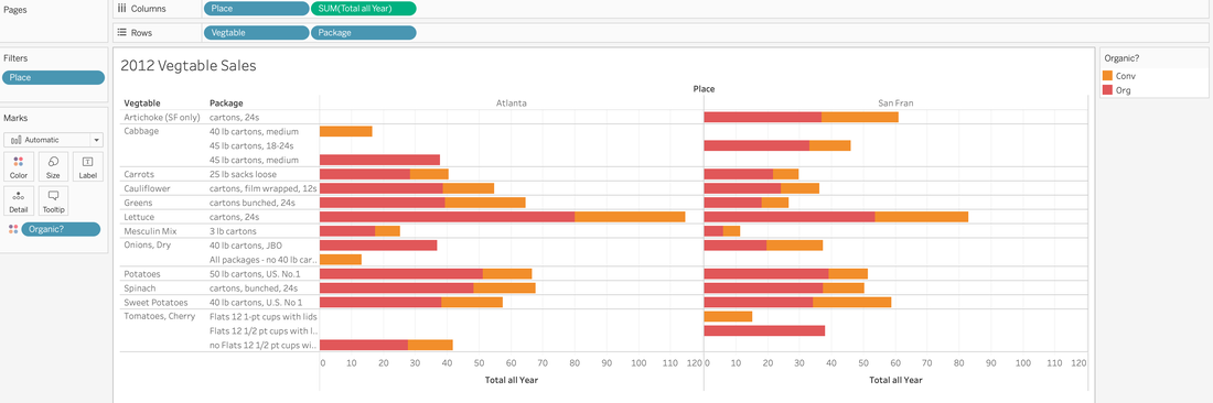
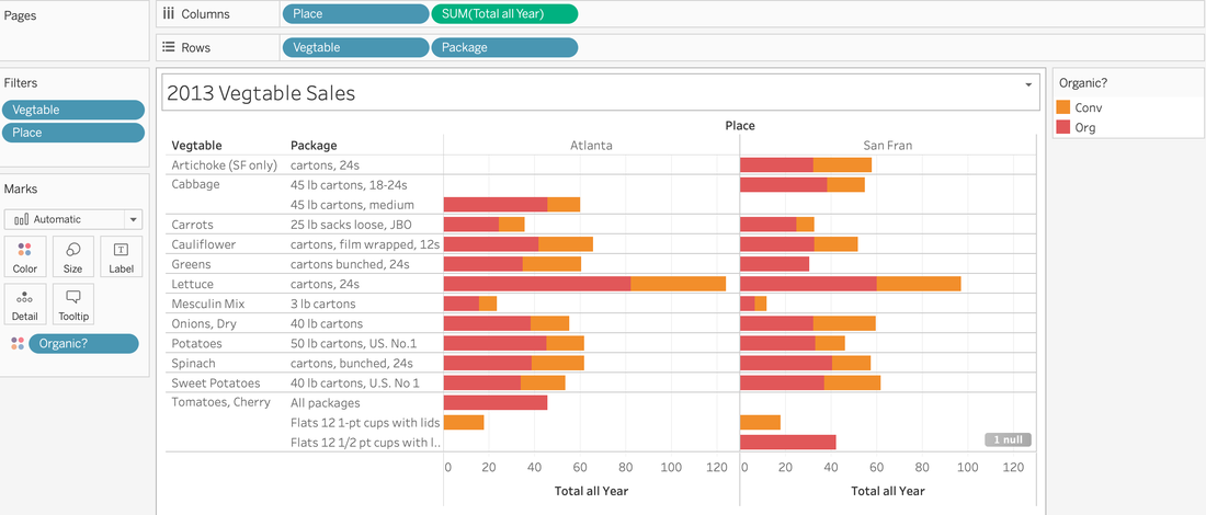
From analyzing both graphs about Vegetable Sales in 2012 and 2013 I can conclude that in both years organic vegetables are preferred to conventional (many pesticides decreases the amount of time needed to grow) vegetables. I can also see that in both graphs and both locations depicted in each graph that lettuce is the most popular vegetable. I found that the use of a bar graph was the easiest to read with the colors used to show organic/conventional vegetables. I realized with this format the information was concise enough to get the point across that I wanted and not too overwhelming in terms of colors/text.
Sydney (2020)
Air BnB Data Configurations:
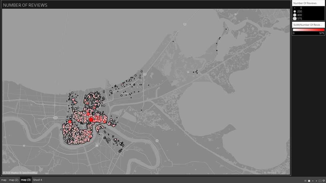
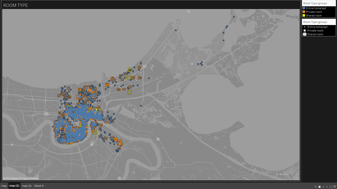
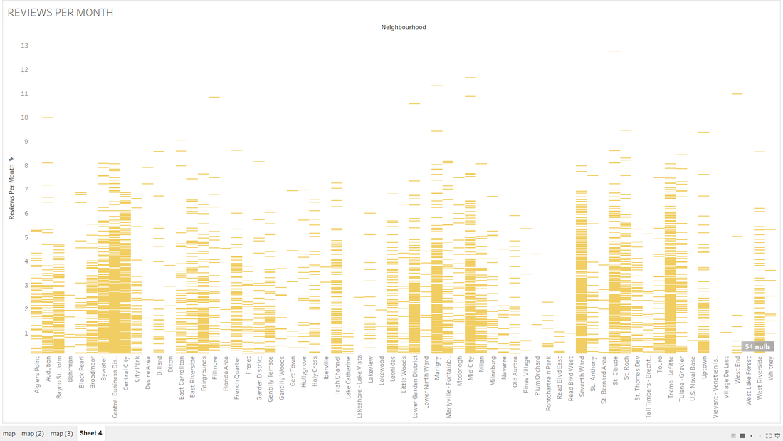
From creating visual data for the New Orleans Air BnB data I've concluded that different clusters of areas are more popular due to their location and types of rooms. In the first data set to the top left the observer can note that most of the Air BnB places to stay are in a relatively clustered area and there are many different neighborhoods to choose from. From the second data set to the top right the number of reviews are spread out but we have high outliers marked in bright red. The Third data set portrays the different room types Air BnB's are offering in this set. Note how towards the center there is a high cluster of blue (entire home) while spreading out towards the edges we get more of a variety of room types (private and shared). Lastly, the bottom right graph provides the amount of reviews in a month each Air BnB host receives throughout the month. Note the few outliers that reside towards the top; this graph would correspond to the second data set.
From creating visual data for the New Orleans Air BnB data I've concluded that different clusters of areas are more popular due to their location and types of rooms. In the first data set to the top left the observer can note that most of the Air BnB places to stay are in a relatively clustered area and there are many different neighborhoods to choose from. From the second data set to the top right the number of reviews are spread out but we have high outliers marked in bright red. The Third data set portrays the different room types Air BnB's are offering in this set. Note how towards the center there is a high cluster of blue (entire home) while spreading out towards the edges we get more of a variety of room types (private and shared). Lastly, the bottom right graph provides the amount of reviews in a month each Air BnB host receives throughout the month. Note the few outliers that reside towards the top; this graph would correspond to the second data set.
|
|
|
|
Emmanuel (2020)
The data set I used was looking at wholesale foods. From the data I made charts looking at the comparisons between vegetable types, packaging and the cities that they are shipped to.
Bradley (2020)
https://prod-useast-a.online.tableau.com/#/site/bseckler/views/NewOrleansAirBnB/Sheet2?:iid=1
|
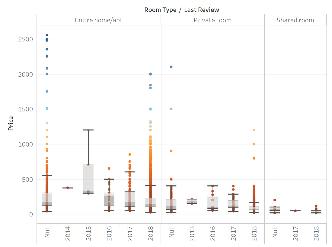
The data set that I used was the New Orleans AirBnB from the canvas page. People when they use AirBnB are probably looking for the best pricing place to stay for an extended period of time, so having some sort of price mapping would be the most logical way of tackling representation of the data. Upon importing the data, I found that it was visually pleasing, but hard to actually read, even after stacking visualization features like size, color, and text. Converting over to a box and whisker plot, I was able to better represent and median and a "upper and lower" hinge and whisker. I could further divide the graph into room type, review dates, ect. I removed all grossly high price tagged AirBnBs, which ultimately converted the graph into something far more readable.
|
Ketki (2020)
Entire home/apt
|
Shared rooms |
Private Rooms |
https://prod-useast-a.online.tableau.com/#/site/ketkibapat/views/AirBNB/Dashboard1?:iid=3
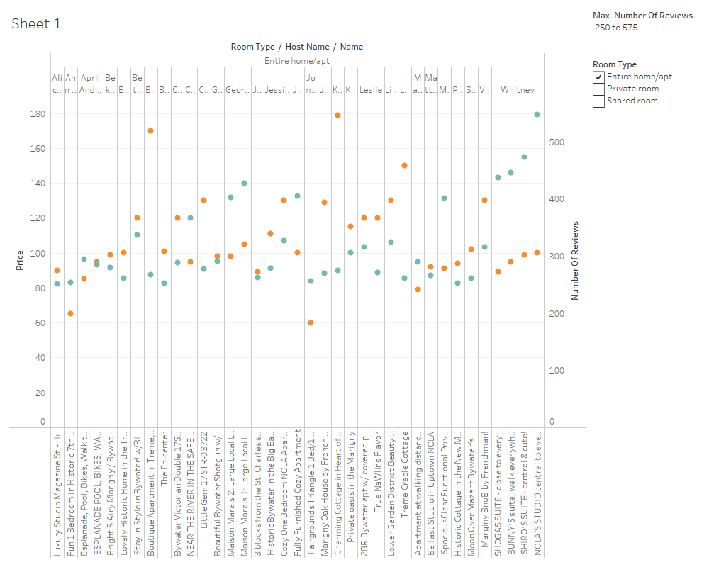
As per graphs, we could see, people prefer whole apartment followed by private room followed by shared since we have more than 250 reviews for apartments and private rooms.
Among the apartments, it can be concluded that, Georgia's both Mansion Marais and John's fully furnished apartment are best since they have highest number of reviews with price around $300.
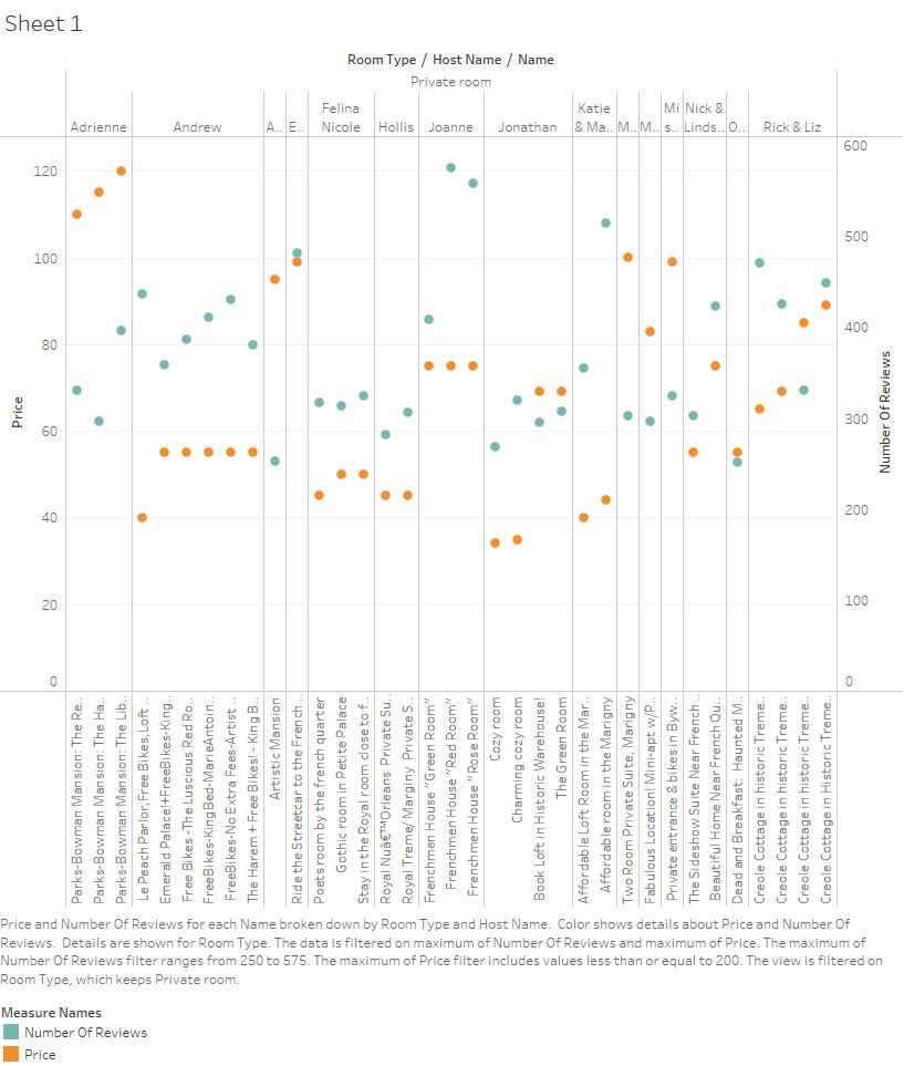
Among the private rooms, Joanne's Frenchmen Houses have highest reviews with price little over $300 followed by Andrew's all private rooms options with price less than $300.
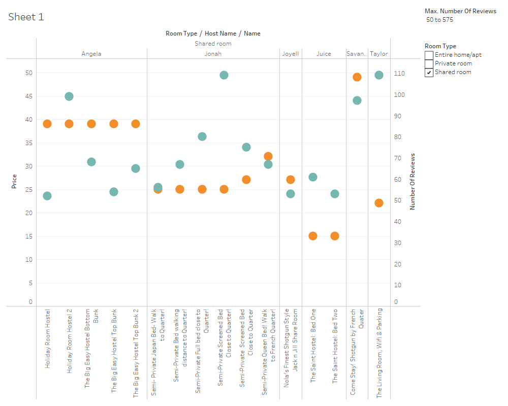
Very few people prefer shared rooms. Shared rooms have maximum 100 reviews with highest of 100 for Taylor's living room with Wifi and parking with price almost $25 which is followed by Angela's hostels higher review with less cost of around $40.
I tried few graphs types like bar graph, line and area chart. I found out the representation of these data was better with these circles, with 2 Y-axes of price and number of reviews.
Among the apartments, it can be concluded that, Georgia's both Mansion Marais and John's fully furnished apartment are best since they have highest number of reviews with price around $300.
Among the private rooms, Joanne's Frenchmen Houses have highest reviews with price little over $300 followed by Andrew's all private rooms options with price less than $300.
Very few people prefer shared rooms. Shared rooms have maximum 100 reviews with highest of 100 for Taylor's living room with Wifi and parking with price almost $25 which is followed by Angela's hostels higher review with less cost of around $40.
I tried few graphs types like bar graph, line and area chart. I found out the representation of these data was better with these circles, with 2 Y-axes of price and number of reviews.